When money moves, so do we — introducing Aria’s new brand identity
Discover the new Aria: A bold rebranding to drive money movement for tech. Explore our fresh look and vision for the future!
Hey, we’re Aria
When we started Aria in 2020, we built an invoice financing API that developers could easily integrate into their marketplace checkout. It was a simple but effective idea (if we say so ourselves) and our first brand reflected that. Familiar tech blues, sans serifs, code snippets, etc. embodied our startup roots and served us well in our early years of growth.
But when we looked ahead to the next 5-10 years, it became clear that our brand needed to evolve to match the vision we had from the start. For the goal was to always do something bigger — much bigger.
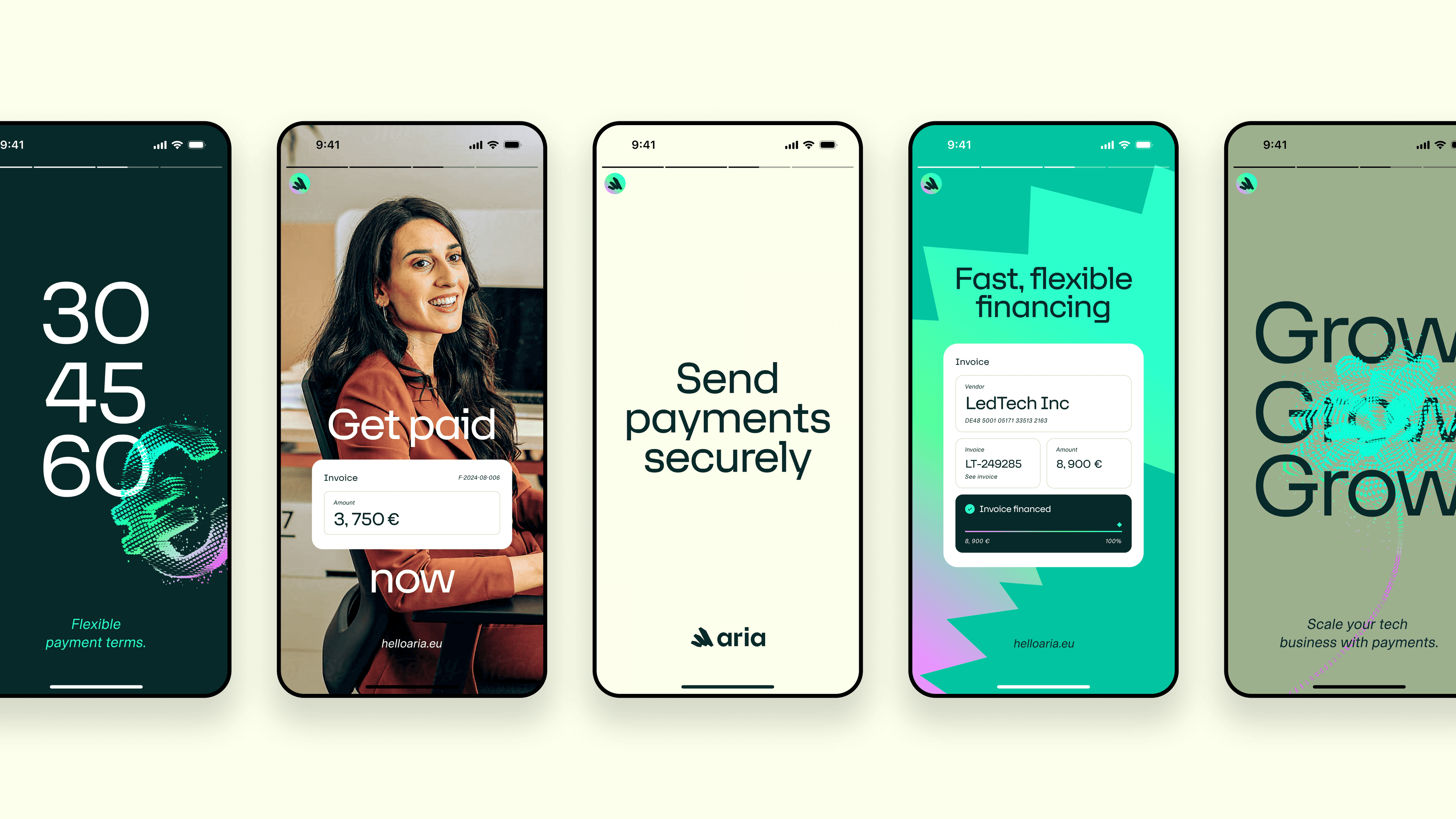
So, with a successful Series A funding round in our back pocket, that’s exactly what we did. Aria evolved from an industry-agnostic, white-labeled API to a comprehensive payments infrastructure that empowers companies to embed payments into their product — with tools for financing, payment processing, risk monitoring, onboarding, analytics, and much more (all of which you can see on our shiny new website.)
What’s more, whereas we’d previously focused on marketplaces — who continue to be a big part of our customer base — we felt it was time to help any software company facilitating payments between two businesses. Our vision was to make it as easy as possible for companies to become fintechs, with their very own payment experiences.
All things considered, we needed a new story and identity that would better reflect who we are in 2024 — and beyond.
Building a brand that moves money for tech
Our rebranding journey began by stripping everything back to the basics. We asked ourselves: What story do we want to tell? What do our customers really need? What was our vision from the start?
The answer lay in the discrepancy between B2C and B2B payments. While consumers enjoy a multitude of flexible financing options, business payments often lag behind. In a world where the economy moves at lightning speed, how can payments still take as long as 90 days? (Seriously, they do!)
After all, our clients are all about facilitating digital interactions, getting rid of trade barriers, and creating a more open economic system. In other words: speed, efficiency, innovation.
We sat around the table and thought: What if Aria’s role was to make these connections even stronger? What if — by building purpose-built payments tools — we could oil the wheels of the tech industry and unlock its full potential?
This vision crystallized into our purpose and core brand idea: to make money move for tech — and became the foundation for everything else, visual and verbal.
We also revisited our values and asked what we wanted our brand to be known for. Frictionless, flexible, human, and transparent. We wanted to create something that steered clear of buzzwords, trends, and fads. Something that felt entirely unique in the payments space and spoke the language of our customers.
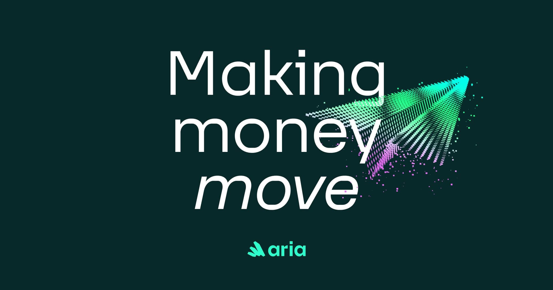
Our logo: a symbol of money in motion
While a brand is much, much more than just a logo, it plays a pretty important role in our new visual system. Why? Because it represents our commitment to fast, easy, and global money movement for tech companies facilitating B2B payments.
The logo’s design is simple yet symbolic, showing money in motion in its purest form. It works just as effectively in static applications as it does in motion, with an animation that serves as shorthand for digital money movement. Alive, smart, and dynamic – just like the payments we facilitate.
Painting payments green
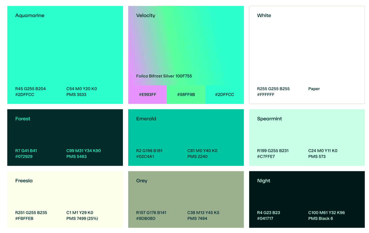
Something we realized quite early on was that we needed to move away from the blue that dominates payments and the wider fintech space. After all, one of the most recognizable assets a brand can have is color.
Our refreshed palette is inspired by the world of physical currency — euros, dollars, pounds, and so on — yet also feels electric and alive, with gradients bringing the concept of digital money movement to life. And crucially, there’s not a blue in sight.
Visualizing money in motion
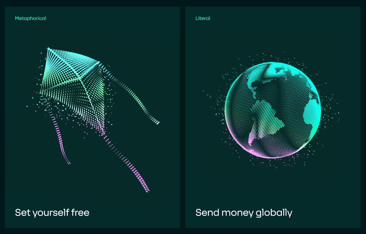
Much like Aria’s new color palette and logo, our illustrations are designed to bring the concept of digital transactions to life. They show Aria’s ability to make payments a reality for businesses across the globe, connecting with our broader visual language. Whether metaphorical or literal (we’ll let you guess which is which) illustrations support our written messages and add depth to our brand narrative.
Likewise, our graphic devices — the square, rectangular shapes that live across our entire system — play a key role in the new identity. With each square representing a single digital payment, we’re able to show both the scale and seamless flow of payments moving through our platform.

Who said tech couldn’t be human?
Last but not least, photography. As we figured out in our brand values, the human element is paramount to Aria. Through portraiture, we capture the essence of money in motion from the perspective of real people. Our photography showcases genuine human emotion, intertwined with the positive momentum that comes with better B2B payment experiences.
Whether it’s our customers or their end users, we genuinely care about creating better opportunities for people by moving money. That might be getting paid straight after submitting an invoice (and not waiting 90 days). Or being able to pay for something in instalments instead of upfront. Whatever the use case, our photography is designed to visualize the joy of fast, flexible payments.

Meet the new Aria
We’re super excited to introduce you to the new Aria brand, designed to reflect our growth and vision for the future. Head to our website to see it in action, and please don’t hesitate to contact our team if you have any questions.
Merci,
The Aria team